I mentioned the Rule of Three last week so I thought I would talk about it a little more today.
Here is the definition and a discussion of the Rule of Three on Wikipedia.
So, the rule states that there are two parallel horizontal lines that divide the space into three equal parts and there are two parallel vertical lines that divide the space into three equal parts.
Let's look at some card examples to see how I have used this rule. I created a grid from clear plastic to put over the cards so that we could "see" the equal space more easily.
This card fits the Rule of Three quite well. The card is divided into three vertical spaces, although they are not quite equal. The card is also divided into three horizontal spaces, very close to equal. The other composition strong point is that the wreath follows the horizontal and vertical lines.
This card has three divisions of the vertical space.
This is another example of the space being divided into three vertical parts, with the addition of the sentiment at the "Sweet Spot" where two lines intersect.
This card has three divisions both horizontally and vertically. The vertical space is equal but the horizontal isn't. Also, If I had had this handy dandy clear plastic template, I might have dropped the poppies down a fraction so that the bottom of the frame aligned with the lower horizontal line. Then the sentiment would be right on the Sweet Spot too!
Three horizontal spaces that are not equal. The sentiment is behind a Sweet Spot, but not centered on it. That still works better than having the sentiment centered on top. It is more visually pleasing when it is close to centered over that spot.
This one has the boots right on the lines and the mantel right on the upper line. The boots help break up the space into three equal areas.
This card has three vertical spaces with the shell piece almost centered over the left line and the sentiment centered over the right line. Additionally the sentiment is in the Sweet Spot.
This is the final example for today. The space is divided into three horizontal areas. The sun stamp and the banners are in opposite sweet spots.
The Sweet Spot is where two lines intersect. Often important elements of design, such as the focal point or the sentiment, will be placed in this spot.
Try making your own clear plastic overlay to help you in your compositions. I know I'm going to use mine!
Have a blessed day,
Trude
Showing posts with label Wednesday 201. Show all posts
Showing posts with label Wednesday 201. Show all posts
Wednesday, December 16, 2015
Wednesday, December 9, 2015
Wednesday 201- Beyond the Basics- Ribbons
Welcome back to another Wednesday 201
Have you discovered that ribbons add so much to our paper crafts? Here are a few ways that I have used ribbon on my cards.
The ribbon is actually lace in this card and the lace is used to enhance the old fashioned look of the card. It is simply wrapped around the panel and tied in a knot. A bow would overwhelm the card taking emphasis away from the focal points instead of adding to them.
The ribbon on this card was used both as a transition between the two card stocks and as a counter balance for the snowflake. It also aids in the basic design of the card by bringing the eye from the upper left hand corner (the eye's natural starting point) across the card to the snowflake, in a 'z pattern' down to the lower left corner and then the ribbon strip helps draw the eye to the right. The 'z pattern' is a natural pattern the for the eyes and pleasing to the brain.
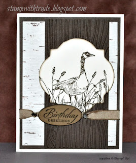
For this card the ribbon is simple. It is fastened with brads on both sides of the oval sentiment and is used to add emphasis to the sentiment. The use of ribbon can be tricky on masculine cards. If I use ribbon on masculine cards it is usually kept simple, no bows.
Here I used the ribbon to anchor the tag. It gives the needed pop of accent color and the bow adds interest to the focal point.
The ribbon is used for a transition on this card between the vertical dark paper and the horizontal printed paper. The bow is placed horizontally and helps that natural 'z pattern' that is pleasant to the eye; it also acts as a counter balances to the group of buttons.
This ribbon is used as part of the card's embellishment. It adds interest, color and texture to the banner.
This card needed the large bow to be an aid to the focal point. The butterfly was not 'heavy' enough to be the main focal point and needed some help. The stripe of ribbon also adds some contrast so that the butterfly doesn't disappear into the brown background.
Because the two ribbon tabs are positioned at the top of the matted sentiment it acts as a counter balance to the flower on the other side. A simple way to add interest and emphasis to the sentiment too.
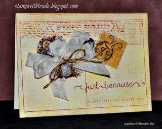
This bow is incorporated into the collage. Using Crystal Effects, buttons, and beads on and around the bow to create the main focal point of the card.
This sentiment is actually stamped inside the card and a window is cut with an oval die. Then the ribbon was wrapped around the right side of the frame and tied in a bow. Another way to add a pop of color and counter balance the fox stamp.
I used twine on this card to go along with the fall theme. I vary the type of ribbon I use according to the type of theme/mood the card has. For an elegant card I would go to the satin ribbon first. For a casual look I would use twine, cotton ribbon, twill or gross grain depending on the theme. When I create masculine cards the choices are the same as the casual cards. For feminine cards I use more satin, lace, seam binding and cotton ribbons.
I used ribbon to embellish the embellishments on this card. The small nosegays just needed a little extra emphasis.
This sample shows that you don't even need a lot of ribbon to add a special touch. I used about 3 inches and cut a 'v' in each end then wrapped the prongs of a decorative brad around it. It is just enough without being overwhelming and it draws your eye to the sentiment.
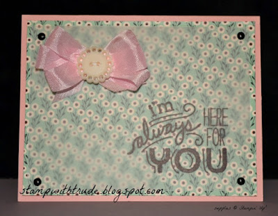
A simple ribbon bow can be very effective too. For an even more feminine look, switch out the ribbon for a lacy bow.
Here I wanted to bring in more color so I repeated the color of the lobster and then added a contrasting ribbon. The ribbon is a dotted gross grain and the overall feel of the card is masculine, so I kept the ribbon simple and flat and added a bottle cap with a stamped anchor insert to continue the marine/nautical theme.
This elegant card calls for an elegant ribbon I used a knot instead of a bow so that it would add interest, but now flow over onto the next panel and distract from the focal point. I also ran it behind the focal point panel.
Have you created any banner cards? Use twine or ribbon to anchor the pennants. Here's another card with a banner. but instead of the banner being the entire width it is to one side and is balanced by the embossed white swirl.
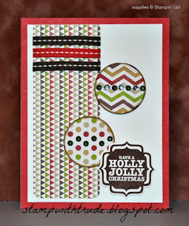
The next two cards use ribbon to move the eyes across the card. The first card has a wide ribbon that had the effect of dividing the card into three spaces. That uses the rule of three. Threes are also pleasing to the eye. You can look back through the samples and see how I have applied this rule. Sometimes I use three of the same item, sometimes I use groups of three and then as in this top card there are cards with three 'spaces'.
In the second card you can see that it again employs the 'z pattern' to move the eye across the card.
I know this is a very long post. I hope that it has been interesting. Have fun with ribbon, you will find that it can add so much interest to your projects!
Have a blessed day,
Trude
Wednesday, December 2, 2015
Wednesday 201- Beyond the Basics
Today's Beyond the Basics is about using vellum to enhance your paper projects.
This post is barely scratching the surface of vellum. If you are on Pinterest you can put vellum in the search box and find many more ideas for incorporating it into your projects.
On this sample card I used a printed vellum from Stampin' Up!s Fall catalog. To attach vellum to your projects you have to get creative because glue and snail tape will show through, and it doesn't enhance the projects. I stitched the vellum to the card stock for this sample. The printed vellum is a quick way to add interest to your backgrounds and it tones down whatever you put it on so you can use a brighter card stock and the card won't be overwhelming.
For this next sample I used the vellum as an overlay to tone down a busy print. I stamped the sentiment directly on the front of the vellum with Stazon ink. With vellum you can't use just any ink pad you have sitting around. Most Pigment type inks will not dry on vellum. If you want to use a pigment pad you can sprinkle on embossing powder and emboss it. Brilliance inks are the exception. For Brilliance inks all you need to do is dry it with your heat tool. You can use most dye inks but even some of them aren't suitable. Some dye inks tend to 'run' on the surface and make a 'halo' around the stamped image. Not what you want to see. That is why I generally use Stazon ink, if I am not planning on heat embossing.
My advice about inks is to try a sample stamp with your ink and vellum and see how it reacts.
To attach the vellum to the card I used brads in the corners.
I stamped this with VersaMark ink and then sprinkled on the embossing powder and heat embossed it. Heat embossing on vellum can be tricky. Vellum warps and scorches easily. Sometimes heating the vellum from the backside and then heating on the front side works well. I advise practicing first before creating your project. Then you will be able to see how your ink, embossing powder, vellum and heat tool interact, and you'll be able to figure out the technique that works best for you. I strongly recommend using an Embossing Buddy on the vellum before stamping on it.
After that I flipped it over and used markers to color in the flower. This makes a quick elegant card. If you experiment with this method you can get a faux watercolor effect that is quite nice.
To attach the vellum on this card I cut the vellum longer than I needed it and then wrapped it around the top and bottom of a white card and attached it to the back of the white card. Then I attached the white card to the colored card base.
Finally, I used an embossing folder with this piece of vellum. You can get some very beautiful effects by putting vellum in embossing folders and running them through your Big Shot. It adds texture and interest, and again the vellum tones down the strong color of the background (Cherry Cobbler).
I hope you have enjoyed this tiny look at how vellum can enhance your projects. I may have to do a part 2 to show you more, because there are so many more things you can do!
Thanks for stopping by!
Have a blessed day,
Trude
Wednesday, November 25, 2015
Wednesday 201- Beyond the Basics- Big Shot
Here's another way to add dimension and interest to your stamped card creations. Use a Big Shot. You can use it to add die cuts, or as in this example actually die cut the card itself. You can also use it to pressure, or cold emboss. You can also see that in this example; I used a woodgrain embossing folder to add texture and interest to the front of the card.
I used the Thankful Forest Friends stamp set.
Here's a good Big Shot demonstration video by Stampin' Up!
I used the Thankful Forest Friends stamp set.
 |
| Thankful Forest Friends stamp set |
Here's a good Big Shot demonstration video by Stampin' Up!
Wednesday, November 18, 2015
Wednasday 201- Beyond the Basics
Today we are going to talk about scraps and the people who save them ☺. I can relate. I have several scrap bins. One is for my Stampin' Up! papers and one is for everything else.
So I pulled out a bunch of scraps and I am going to show you how to tame your scrap bins!
I pulled out any that were Christmas and any that coordinated with any of the Christmas.
Then I started gluing them to folded card bases in coordinating colors.
And after I used as many strips as I could I got out my 1" circle punch and my 1" square punch and here's what I did.
I used up a lot of scraps!
Now I have 22 really colorful fun backgrounds that I made out of Designer Series Paper scraps from previous years.
Check out what I did with these. Click here.
Wednesday, November 11, 2015
Wednesday 201- Beyond the Basics
Well, today isn't technically about stamps and stamping, but it is about using punches in ways that will enhance your stamped cards.
First I used a 1" circle punch, a 3/4" circle punch and a 1/8" hole punch to create this...
A ladybug. Isn't it cute? Here's how it's done...
First I punched 1 black 3/4" circle, 2 black 1" circles and 1 red 1" circle.
I used a pencil to space 6 dots around the edge of the circle, then they didn't show up well in the photo so I used a pen ☺.
Then I punched the marked spots with the 1/8" hole punch and glued the red circle on top of the black circle. Now Cut it down the middle so there are 3 dots on each half. Layer it over the other black circle and glue the 3/4" circle under the layers with just a small portion sticking out. Doesn't it make a cute bug?
Okay, next I took some tissue paper and folded it in half. Then I folded it in half again and once more so that there are now 8 layers. Yes, I even used a piece that was formerly used in a gift bag...re-purposed!
Then I punched out one stack with a 1 3/4" scallop punch and one more stack with a 1 1/4" scallop punch.
Next I used the 1/8" hole punch to punch a hole through all the layers of both sizes stacked together.
Now choose a brad, any brad because you won't see it when we are done, and put it through the hole and spread the prongs open on the back side.
Begin scrunching the layers one at a time around the brad.
This is how it looks when you're done. Isn't it cute? You can use these on all kinds of 3D projects, such as boxes and gift bags.
Here's another idea. I used the same scallop punches and wrapped thread around them. These are called Spirelli and they are easy and fun to make. I taped the string to the back, wrapped it over the front to another indent several spaces away. The more spaces in between the first wrap, the closer the spiral will be to the center when you have completed the wraps. Then wrap the thread around to the back and through the next space to the right of where you started. Wrap it over the top and to the next space to the right of the space you wrapped it to the back the first time. Then continue the sequence.
I think I am going to make a scrapbook page with some of these elements, so check out my blog next Sunday to see what I came up with. Click here to see the page I created.
Subscribe to:
Posts (Atom)


